Over the last few months I had the chance to watch a beer come to life. I was invited to participate in Schlafly’s annual Artist Series release where their brewers work in tandem with a local artist to develop, name, and package a beer from scratch.
In our first meeting the brewers led the conversation talking about ideas they had been wanting to try and thinking about what might make a good fit for the Artist Series beer. We knew it would be a late spring/early summer release so it made sense to think about lighter flavors that would be good to drink outside in the sunshine. Also, because it would be a one time event beer it made sense to try something a little outside the box. As the brewers were discussing different extracts and obscure processes somebody joked that it was a bit like listening to a bunch of alchemists compare notes which became our first design direction.

I went home and started compiling mood boards and making some early sketches taking a lot of inspiration from astrology charts, cabinets of curiosities and old medical diagrams. When the design team (Sarah Frost a designer for Schlafly, Will Rogers the brand manager and I) met again we all agreed that we were excited about this vibe and that it left a lot of room for creating fun imagery for the label and eventually a cool interactive exhibit at the Art Oustide event where the beer would premiere. We still didn’t know exactly what the beer would be or what it would be called though.
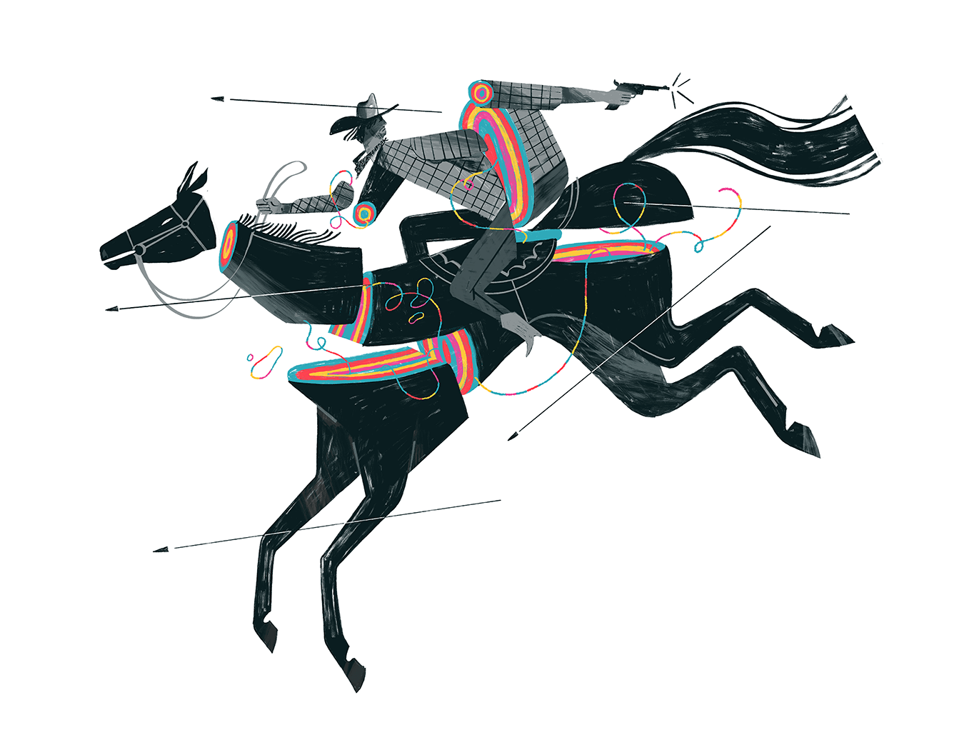
The next time we all sat down the brewers had done some experiments and narrowed in on a direction. It would be a golden ale with ginger and lime extracts which they would then age with chips from bourbon barrels giving the beer a hint of bourbon flavor. So basically it was Schlafly’s take on a Kentucky Mule. Initially we in the design group thought we were going back to square one, since bourbon and the Kentucky mule cocktail come with a pretty established set of visual references. We started thinking about cocktails or western motifs, smugglers, saloons etc but it all felt pretty straightforward and nobody was as excited as we had been with the alchemist/ witchdoctor vibe.
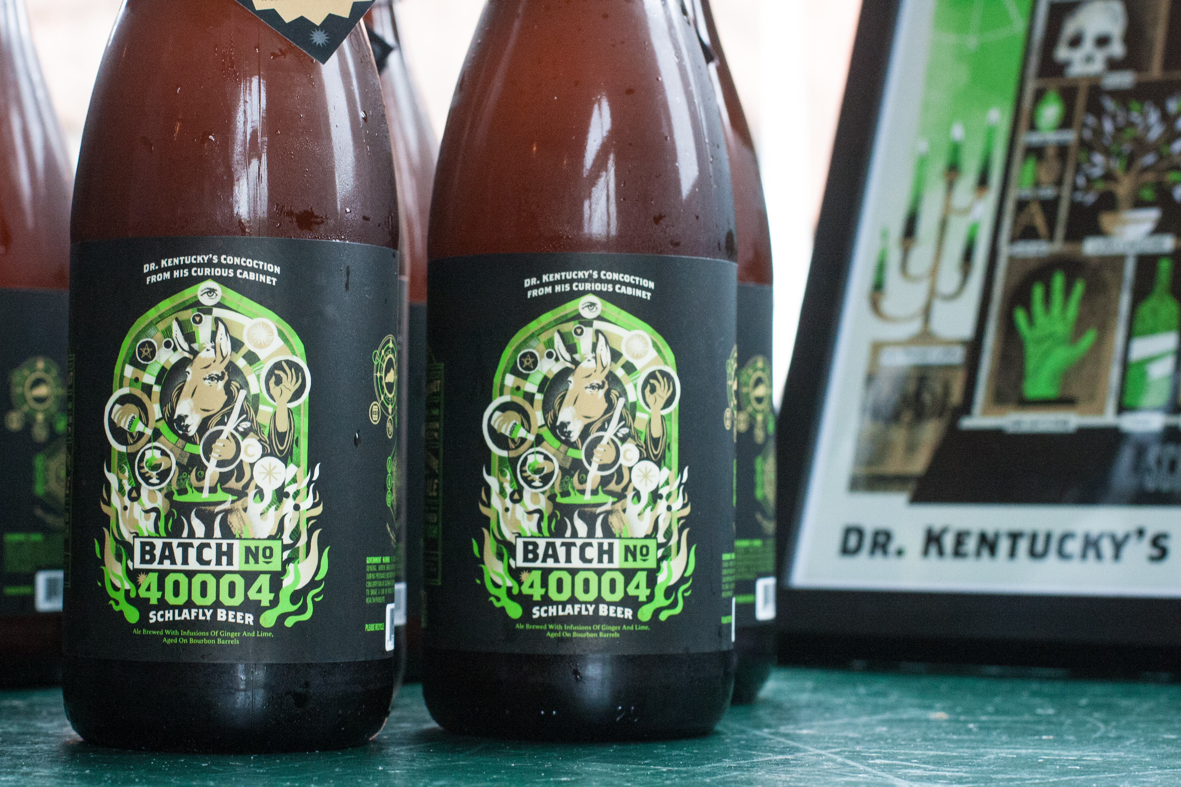
At that point we realized that we might find something new by combining the two concepts and so was born Dr Kentucky: the mysterious potion maker with the head of a mule. I thought it would be fun to pull the color scheme directly from the recipe and so we wound up with gold, green, and dark brown palate signifying ginger, lime and bourbon. We thought about giving the beer a purposely wordy title harkening back to advertisements for dubious medical tonics and cure-alls. we settled on “Dr. Kentucky’s concoction from his curious cabinet. Batch No. 40004”. The number is the zip code of the county in kentucky where bourbon is made.

With all of this in mind I went back and created some more detailed sketches taking the idea for the character and trying to put it in the context of a label.

We agreed that the sketch with multiple hands and a flaming cauldron was the best fit for the mail label and I went ahead with turning that sketch into a finished design. My first version used a hand drawn symmetrical 40004 which was cool but competed for attention with the illustration. I swapped that out with a blocky type version.

Once this main label was locked in it was time to move on to the rest of the bottle. I came up with some diagrams/runes that illustrate the basic ingredients in beer and in the Kentucky mule. We came up with a long-winded description description trying to reference the style of early medical elixirs and traveling snake-oil salesman.


Once our final beer design was in I put together a poster to show Dr. Kentucky’s cabinet of curiosities. These will be available at the art outside event along with a variety of other mysterious prizes.
It was an absolute pleasure to work with the team at Schlafly throughout this process. They trusted me and gave me a lot of leeway to push things as far as possible, always contributing ideas to make the final product better.
The beer will be hitting shelves around St Louis this week and it's really, really (really) good. It brings together a lot of different flavors with a really light touch and it's surprisingly refreshing. I'm not just saying that because I have to. There is a lightness about it that is a little bit like ginger beer or even Kombucha, but combined with a really solid golden ale flavor. I plan to enjoy plenty of it this summer. Hopefully you will too! thanks for reading.